Sunday, November 9, 2014

smash cake

smash cake
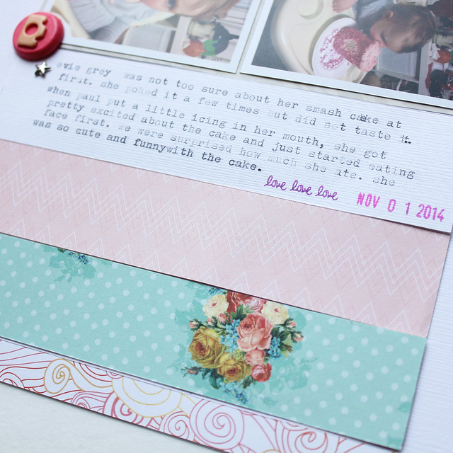
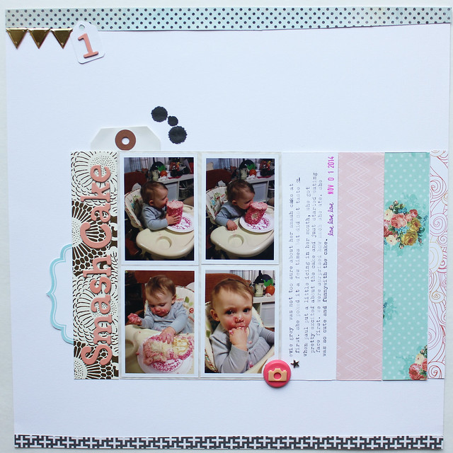
I made this layout for last week's Sunday Sketch at Studio Calico. As soon as I saw that the sketch had four small vertical photos, I knew it would be perfect for photos of my niece, Evening Grey, on her first birthday last week. She was so funny with her smash cake and I love the progression the photos show- going from her nicely eating a bit of icing, to in the end, she's completely covered in cake. 

smash cake 2  
I used the Roundabout kit from Studio Calico and the add-ons. I think I actually just used the Outer Banks and Navy Pier add-ons. Those add-ons were just perfect for a layout of this sweet girl's birthday.

smash cake 3

That gold Anna Griffin paper is just beautiful. I knew it would be perfect for beneath the title as focal point of the page. I still have about half a sheet of it left and I think I'm going to be hoarding it from now on. I really loved those Thickers that came in the Outer Banks kit. I love when the packages are a combination of upper and lower case and they are the perfect shade of pink.

Did you make a layout for last week's Sunday Sketch? If so, please link it in the comments. I would love to see it!

Wednesday, November 5, 2014

october part 3


Alternative title for this post could have been "Scrap the imperfect photos". I love beautiful photos. I am always learning new things about my camera and love trying to get that perfect shot.

Sometimes though, a moment provides an imperfect photo. Maybe it's grainy or maybe it's blurry. Maybe you think you shouldn't include it because it's not a great photo. Sometimes though even an imperfect photo is better than no photo at all. This week I have two photos that are blurry and two that are grainy because they were taken with my iphone in a dim room. I couldn't imagine not having those photos in our album though. They all document special moments in our week or are great photos, even with their imperfections. 


The top right photo of Derek and Andy is blurry as Andy's hands were moving. I love the photo though because it documents a time they spend alone together and I love that Derek sends me photos while I'm at work. The bottom right photo is our friends kissing during their first dance at their wedding. It's a dark, grainy iphone photo that I edited the best I could, but it's a great moment, so I wanted to include it. Also, that cake was the best wedding cake I have ever had and it was gluten free too, so it definitely had to be documented.


I know this might seem like an odd sentiment, but Derek and I tell each other we are 'the worst' as a sort of term of endearment.


In the bottom right photo, Andy's hands are blurry again as he is an active toddler. The photo is of him sweetly singing songs before bed. That night, we sang the sesame street theme and '1,2,3,4' by Feist over and over. Andy looks so happy and I really wanted to see that sweet photo in our album.


With the exception of one gold puffy heart sticker, I made this entire spread using leftovers from the Studio Calico Planetarium kit and add-ons. I really, really loved that kit!

I know it goes against everything that feels natural about scrapbooking, but I strongly encourage you to include some imperfect photos in your next spread if the memory behind the photo is important enough that you document it. 

october part 1


This is my first spread of October and somehow I managed to fill a full spread with photos from only four days. Highlights are my in-laws moved, crepes with old coworkers, a bachelor party, and both rough and amazing days with Andy. Little and big moments that all deserve to be documented.


I decided to type my journalling right on that 'Now' card and I totally messed up. So then I typed it onto a plan white 3x4 card, but I ended up messing up at the end again. I decided just to roll with it this time and glued the new card right on top of the 'Now' card where I messed up on. I real life, you have to look pretty hard to see the line where the new journalling card was added.


I love those chunky silver glitter thickers. Those wood veneer leaves came in a Studio Calico kit from November 2012 and I have been hoarding them ever since. I  really love them.


My husband's friend wanted to rent sumo suits as part of his bachelor party and have a wrestling tournament. This photo was captured on a phone that is longer than a true 4x6 photo and I couldn't crop it without cutting people off at one of the ends. I decided to crop the photo at 4x8 and just split it between two pockets. I'm really happy with how it turned out and am glad I was able to use the entire photo.


With the remainder of the pocket, I stapled some of those amazing Crate letters to some patterned paper and made a little cluster with a label, ticket from October Afternoon Miscellany pack, gold camera, enamel dot and wood veneer star. I really love treating pockets like mini layouts when I can.

Tuesday, November 4, 2014

five of my favourite project life things


This is my third year doing Project Life and I just couldn't imagine my life without it. It is so much more than a family photo album as it also has our stories attached to those photos so we never forget what was so special in that moment that it warranted a photo. Not to mention the addition of lots of pretty things. 

In the almost three years I have been doing this project, I have learned so much about how I create. Mostly, I have learned that I am a creature of habit. It is really hard to stick with a project like this and I feel that one of the reasons I have been able to do it for so long and stay (mostly) up to date, is I really have my process perfected now. 

I basically use the same products on every single spread and while some may think that is boring, it allows me to get each spread finished fairly quickly and I'm okay with that. I vary the colour combinations I use every week, so I think my albums have variety. By using the same products on each spread however, they still have a cohesive look.

So, without further ado, here are my five favourite products I use on Project Life. All five of these, without a doubt, appear on every single spread I make. 

1. Labels - I have a ton of the label sheets that Marcy Penner (Hello Forever) makes for Studio Calico each month. They are a pain to cut out since I don't have a Cameo, but they come in the loveliest colours and are the perfect size for Project Life. My albums are very photo heavy, so the labels are the perfect way to add journalling when I don't have enough 3x4 spots to fit it in. I also just cut the longer labels down to fit the size I need them for. Lots of companies make label sticker sheets now too.

2. Enamel dots - Ahh enamel dots. I still remember the first time My Mind's Eye came out with the enamel dots. I thought I died and went to embellishment heaven. Most manufacturers have their own version of enamel dots now and I love and want them all. They add the perfect little pop of colour to a project, are so nice and small and have a little dimension, without being too chunky. The perfect embellishment in my opinion.

3. Alphas - I really love the impact of using large alphas on my Project Life spreads. I often use Thickers to make titles in 4x6 pockets where I have put a square photo. On 4x6 photos, I usually use smaller, flat alphas- Basic Grey or the small sets that come in the Studio Calico PL kits, 

4. Wood veneers- They are so versatile and I know a lot of people stamp on them, spray, or emboss them, but I really just love them in their natural state. They're a great neutral embellishment and come in so many great shapes There are a lot of small veneer options too, so they are the perfect size for Project Life. 

5. Washi tape- Like most scrapbookers, I have a pretty good sized washi tape collection. Somehow though, I almost always end up using the five tapes pictured above. They are colourful, without having too busy of a pattern. I use a combination of those five on almost all of my spreads and I cannot believe how much of them I still have. Washi tape is definitely one of the most cost effective embellishments you can buy as they last forever. They are also perfect for the scrapbookers who love to embellish, but don't like a lot of bulk to their pages.


There are lost of other items that show up in my spreads, but these five are definitely the ones that I turn to week after week. What are the products that you use every week on your spreads?
Monday, November 3, 2014

four sweet girls


Another Studio Calico Sunday Sketch layout. I used the Camelot main kit and this layout came together so quickly.


I changed the top of the sketch a bit and added a couple of large tags and put the title on the tags. I matted the photo and journalling strips on vellum. I really adore that vellum and it was hard to use that large of a piece.


I typed out my journalling and cut it into strips. And I just realized that I missed a strip of journalling, so I going to have to go back and add that now.

Sunday, November 2, 2014

happy to you


The layout is about my son's second birthday and how much he loved when everyone sang Happy Birthday to him and then how when he started to sing the song, he called it "Happy To You".

I made this layout almost entirely using Studio Calico's main Camelot kit. I added in the 'Happy Day' banner from Crate Paper, a chipboard frame, chipboard cupcake, and a few small embellishments and piece of washi tape from my stash. I really loved this kit, but since I only got the main and it came with the mask and ink dabber (which I love), I have had to supplement with embellishments from my stash usually when making layouts from this kit. I don't mind at all as there are few things that are as satisfying as using up your stash.


Little bits all lined up again. That large veneer star came in an older Studio Calico kit and I just loved them. I've been using them sparingly. That gold triangle washi is one of my favourites. It came in a class kit at Studio Calico and I am going to be so sad when I'm all out. Gold washi just seems to go on everything.


I love the way the layers of banners look across the page. The banner pieces of patterned paper I made from a pattern I cut based on banner pieces from Basic Grey. I love the variety sizes. I don't have a die cutting machine, so I cut them all out by hand. It was a bit of a process.


I've said it before and I'll say it again, I'm sure banners are very 'out' now, but I love them and use them whenever I can. 

The Chipboard cupcake is from the October Afternoon Cakewalk Miscellany pack. I thought about altering it, but as there is so much going on on the page already, I liked the plain look if it.


I used gold Dymo tape to make my title. I love my Dymo label maker so much because I never have to worry if I don't have enough vowels to make my title. As long as I have tape, I can put as many As or Es in my title as I want. My Dymo label maker is definitely one of my most used tools. It appears on most of my layouts and almost all of my Project Life spreads. I even have some neon tape and a cursive cartridge.

Also, those Dear Lizzy gold rub ons, swoon!

Is there a tool that you use while scrapbooking that maybe isn't a traditional scrapbooking tool that you just couldn't imagine scrapping without?

Saturday, November 1, 2014

june part 1


I made this spread sometime in the summer and just got around to photographing it last week. I couldn't believe jut how "summer" it felt when I pulled it out of the album. Almost all of the photos are taken outside and the colours are light and bright. I think this spread really encompasses whta summer is all about.

I loved that wood veneer "june" that came in the (surprise, surprise) June Studio Calico Project Life kit. I usually do my monthly pockets in a 3x4 spot, however the veneer was a little to big, so I taped it on top of a photo of my phlox.


We went to go visit friends in Toronto and the skyline from their balconey at sunset was just stunning. I took so many photos and cropped this one at 4x12. I then cropped that 4x12 photo in Photoshop into 2 4x6 photos. I get my photos printed at Costco, and by doing this, I only have to pay for two 4x6 photos ($0.34 total) as opposed to printing a 12x12, which is $4.99 I believe.


One of my favourite parts. I added a neon pink reinforcer to the hole on this white tag and did some typing on it and yes that is an 'i' instead of a 1. My typewriter doesn't have a 1 and I haven't learned how to do capital lettters on my typewriter yet.


That skyline badge was just perfect for journaling about our night in the "big city". I lined it up with some other little bits on some neon washi tape.

It seems very strange to be talking about a spread from before summer even offically started when we are right in the heart of fall, with more leaves on the ground than trees currently and downright cold mornings. With winter right around the corner, I know I'm going to be looking at this summery spread over and over, wishing we were back in warmer days.