Wednesday, December 31, 2014

kit killing: december edition


That would be 12 layouts and 3 6x8 Project Life spreads made with the December Hip Kit Club kit. I don't think I could have loved this kit any more. The papers were just beautiful and it had the perfect amount of embellishments and alphas. The kit featured the new lines from Amy Tangerine, Pebbles, and Heidi Swapp, as well as embellishments from Evalicious. I only got the main kit and I just can't believe how many layouts I was able to complete. 

I actually have lots of the gold word thickers, wood grain thickers and Amy Tangerine die cuts left. This kit was just so full of amazing items. I don't have much patterned paper left though, so I consider this kit killed and will move the remaining embellishments into my stash.


I think this might be my favourite layout I made with the kit. The colours go perfectly with my photo and I loved that the wood veneer camera said "adventurer" on it. Perfect for a photo of my curious boy out for a walk.


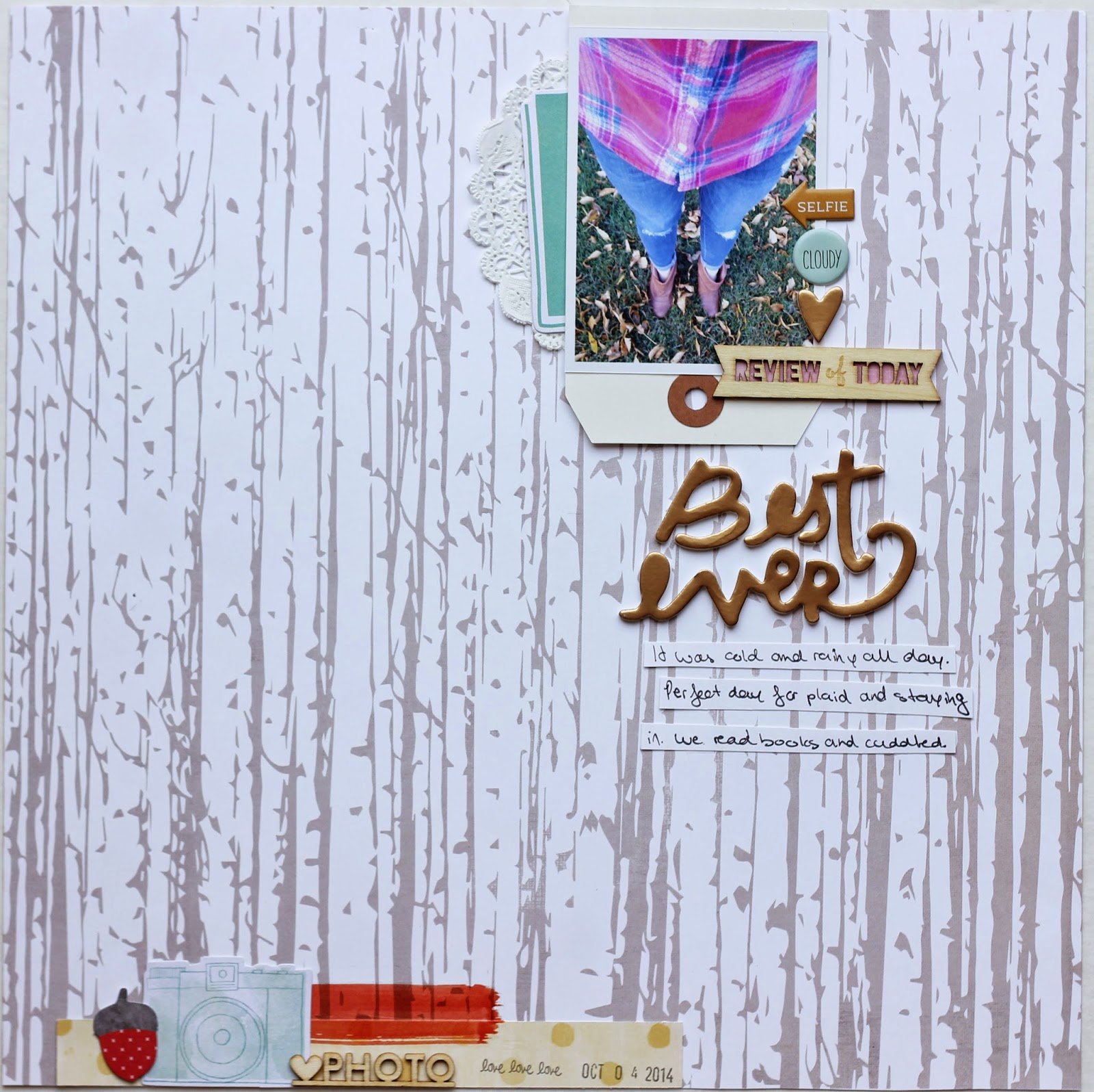
That wood grain paper is just perfection. I immediately thought of this selfie I took on a rainy fall day and knew they would go together.


I added in some wood veneer stars and trees, as well as some gold sequins from my stash for this layout. It's pretty rare for me to use anything other than white cardstock as a background, but I really love the way this black and white striped paper goes with my photo.

  
I am just crazy about those Dear Lizzy gold word thickers. Wood grain thickers are actually a serious weakness of mine and I really loved the ones that came in this kit. I just couldn't stop using the gold thickers though and they ended up on most of my pages.


I used a grid pattern for this layout to get as many embellishments as I could on the page. To keep it from being too busy, I tried sticking to blue, grey and gold colours.


I made this layout based on a sketch from Paper Issues. Those floral die cuts with a bit of gold were my favourite in the pack and they went perfectly with the soft pink paper with white polka dots.


That floral paper was definitely my favourite in the entire kit. I really wanted to use the entire sheet as a background, but I just couldn't make it work. I really love it here grounding a layout of a selfie my niece, Ruby Sky, and I took on Christmas day. She really loves to selfie!


I based this entire layout around that section of paper that says "cozy up to a good book". I actually really struggled with this one and pushed paper for way too long, before just deciding to glue stuff down. I'm not entirely happy with it though and feel like it's missing something. I may add to it later.


'Shine' is the perfect way to describe my youngest niece. She is just the happiest baby. I really like that blue "v" paper by Amy Tangerine and think it would make a really nice background paper as the pattern is subtle.


I just love how this one turned out. I know I basically just cut the piece of patterned paper apart and glued it to white cardstock,but it adds a little more dimension than just using the paper as is. If my sewing machine was working, I would definitely have sewn lines through each strip of paper. I added the gold star rub ons to my photo and my title in between a strip of paper. Super simple, but I'm really happy with it. That photo of my son also makes my heart melt. It's just so him.


This layout is based on a sketch and love how much of the grey heart paper I got to use here. Amy Tangerine makes such amazing patterned papers. They often have really subtle patterns that work so well for backgrounds.


This one is also based on a sketch. The circles are die cuts from the Amy Tangerine pack that came with the kit, one circle rub on and a few are just circles I punched from papers that came with the kit.

I also made 3 6x8 Project Life spreads, however it turns out the photos I took are all blurry, so I'll have to re-take them later.

My January Hip Kit Club kit should be arriving in about two weeks and I'm just so excited. I also got the embellishment add-on this month and can only imagine how many layouts I'm going to be able to make with this one.

I'm really happy with my decision to subscribe to the Hip kits after only two months. They are filled with the latest and greatest in the scrapbooking industry, Kim, the owner, is incredibly nice, the design team is crazy talented, and there is a wonderfully friendly Facebook group filled with amazing inspiration. I strongly urge you to check out Hip Kit Club if you haven't already. I promise you will love the kits!

Tuesday, December 30, 2014

fall 2012 mini

Wow, I've been gone for a long time. I didn't mean to be gone for so long, but the holidays crept up on me and they were wonderful and busy and blogging was placed on the back burner. 

I am back today though with a super chunky mini I made using the November Swag Bag from Paper Issues. I knew the colours would be perfect for this mini album and snatched one up almost as soon as they went on sale. I have kicked myself repeatedly for not getting the  merry memories and December swag bags. Swag bags are packed full of wonderful goodies at an amazing price!
Fall 2012 was my son's first fall. I absolutely adore fall, so it was a really special season for me. My maternity leave also ended in December of that year, so I was really trying to soak up all the wonderful time I had at home with baby. Even though I have already documented all of these photos in our Project Life album for that year, I thought it would be really nice to have all the best moments from fall in one little album. I'm really happy with how this turned out and hope you have some coffee or tea, because this post is photo heavy.
 I added some shipping tags, doilies and Hello Forever labels from my stash to put the mini together.

I love that little cork house. It's just adorable.
 I was so happy to get a piece of gold polka dot vellum!
 I couldn't believe how many wood veneer and cork items came in the bag. They definitely helped make this mini super chunky!
Yes my baby stood up for the first time by balancing on a case of beer. We are definitely white trash. Haha.
 I love how the smaller shipping tags and cut out pieces add an extra level of dimension to the album.
 Wood grain paper will always be one of my favourites.
 The cork circles from Gossamer Blue are so much fun.
 I even used the glassine bag the swag bag came in as part of the mini and filled it with the sequins and a yellow vellum leaf that came with it.
 Have I  mentioned yet how much I loved all the cork elements that came with the Swag Bag?
I also ordered the cork circles and enamel dots from Gossamer Blue's Gramercy Road line to use as part of the mini. I love that line. The colours are just perfect for fall, however are so nontraditional.
 I also added in a few Thickers from an older Dear Lizzy line.
That photo of my husband and son looking at each other is one of my favourite photos of all time. I get butterflies every time I look at it.
I just love those die cut leaves. I definitely wish I had more to make a layout with them. They are absolutely adorable.
 I used an acrylic airplane from my stash to document Andy's first airplane ride.
I ended the album with two photos from our trip to Florida.

I love flipping through this album. Looking at these photos all grouped together like this immediately brings me back to fall 2012. The 9 months I was on maternity leave was the greatest time in my life and I'm so happy I have this little chunk documented like this. Thank you for letting me share this album with you!

Tuesday, November 25, 2014

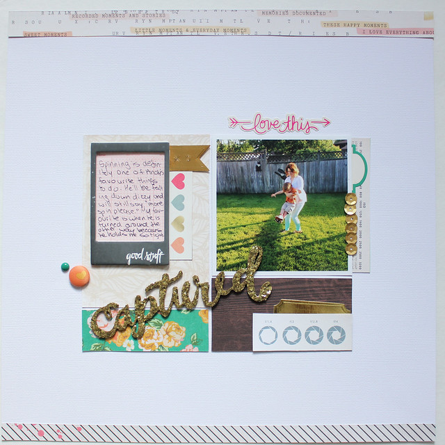
captured

captured1
I just can't get over how much I love Maggie Holmes' newest line, Open Book. I have made so many layouts with it in the last two weeks. It has definitely sparked some creativity in me!

009
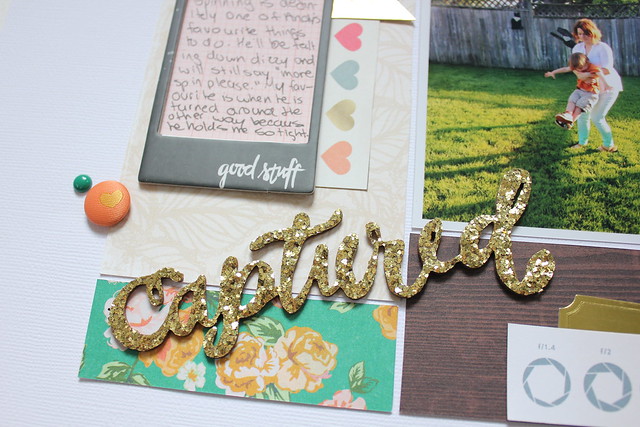
And those Thickers? They are just perfection. I could definitely use a few packs of them.

011

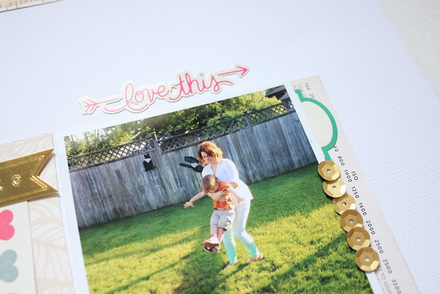
The ''love this'' sticker is actually from Crate Paper's Notes & Things line, which is my other new favourite line. I thought the right side of the photo needed a little something extra, so I added a row of gold gold sequins.

Sunday, November 23, 2014

last week of october

halloween

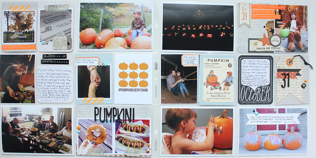
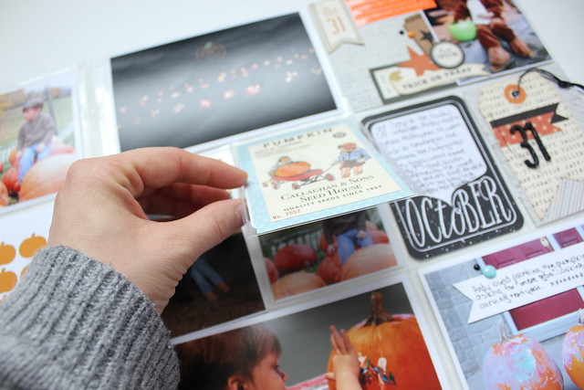
This spread was hands down the hardest spread I have ever photographed. I just could not get good photos of it. I actually photographed this on two separate days in two different locations in our house. This spread is also one of my favourites ever though, so I had to share it, bad photos and all. 
halloween1
This week consisted of municipal election, dinner with friends, pumpkin farm, painting pumpkins and Halloween itself. It was a busy week and there were so many photos to choose from.

halloween2
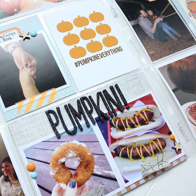
The #pumpkineverything printable from Paper Issues was just perfect for photos of our pumpkin donuts and pumpkin sausages from the pumpkin farm.

halloween3
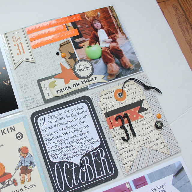
I just love American Crafts' Haunted Hollow line. I got the layered tags and ephemera pack. This is definitely my ideal Halloween line. I love the shade or orange and that it isn't cutesy at all. I like a little spook to my Halloween products. :)

halloween4
 I just love that 'October 31' card from a Studio Calico kit from 2013. I completely forgot to use it last year and have been waiting to use it again this year. I love the spooky font.

halloween5

I used a Simple Stories Photo Flip with a card from an older October Afternoon line. When you flip it up, there is another photo of Andy at the pumpkin farm and journalling on the back of the card. I love those photo flips

Tuesday, November 18, 2014

board games

board games

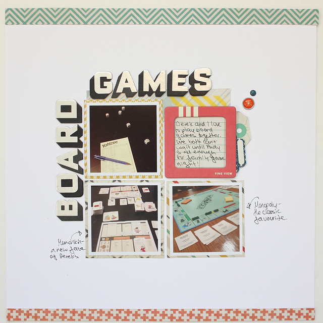
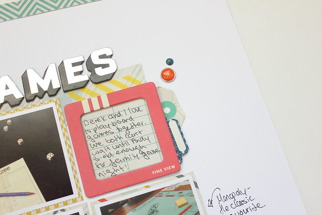
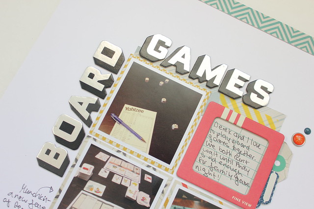
I made this layout for the Get Your Game On Issue at Paper Issues. I am far from you would call athletic and Andy isn't in any sports yet, but board games? Oh, we play a lot of board games in our house. We have a very large game collection and cannot wait until Andy is old enough for family game night!

I have had American Crafts' Chap line in my "maybe purge" pile for awhile now. I love this line, but it's three years old now and there is always a new line that I want to use. I thought the colours in Chap would be perfect for a layout about board games and I'm really happy with how it turned out and that I was able to use some stuff from stash!

board games2
I really love the way tags and labels look layered under photos and paper on layouts.

The chipboard frame is from Crate Paper's The Pier line, but it was the perfect colour for this layout.

052

Funny story about those Thickers. They came in a pack I bought from Winners (Canadan Marshalls) that were 5 for $10. That is an amazing deal for Canada! To put it in perspective, a pack of Thickers from Michaels here is $8.49! Anyway,  because this deal was so great, I didn't mind that there was a pack or two that I didn't like. And I did not like these ones. I have never used them and put them in my purge pile.

When I was looking for a Thicker to use for this layout, I knew I wanted a bold font. This pack was just perfect and I feel they go really well with the 'board game' theme. Well, wasn't I surprised when I looked up the Chap line on the American Crafts website to see that these are actually from that line. No wonder I thought they went well together.

Wow. That is a very long story about a pack of Thickers.

Do you have a scrapbooking product that you didn't like at first, but you either ended up loving or was perfect for a particular project?

Sunday, November 16, 2014

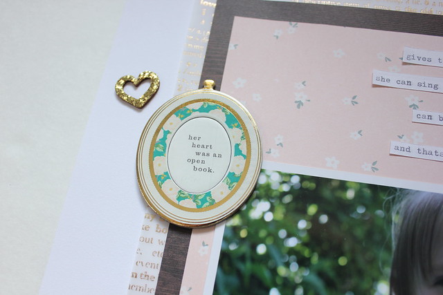
her heart was an open book

RS
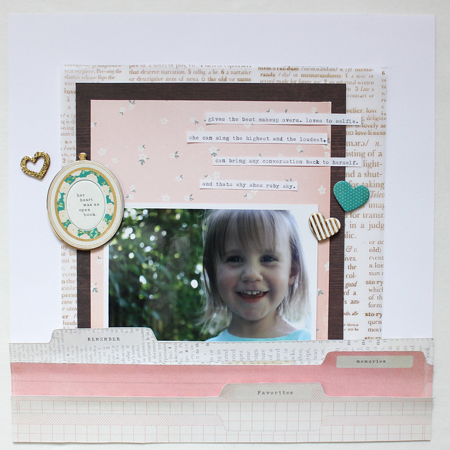
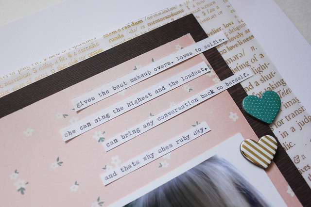
This is the layout I made for Paper Issues Sketchy Saturday. I inverted the sketch as I've been dying to cut that file folder paper apart for ages. 

The layout is about my sweet niece, Ruby Sky and the hilarious things she says. She is the most articulate three-year-old and she is just too funny.

rs3
I just love that gold vellum. I bought two pieces and it's definitely not enough.

033

'Her heart was an open book" is definitely an appropriate title for this layout. Ruby Sky says whatever is on her mind.

I really loved this sketch as it allowed me to really show off some of my favourite papers from Maggie Holmes'new line.

Saturday, November 15, 2014

captured 2

captured a

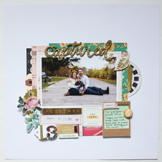
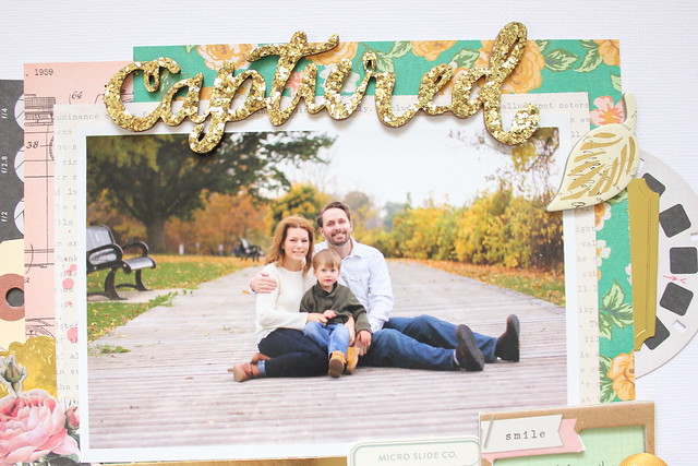
Maggie Holme's new Open Book collection with all of its camera/photography images was absolutely perfect for a photo of our first family photos we had taken a few weeks ago.

019

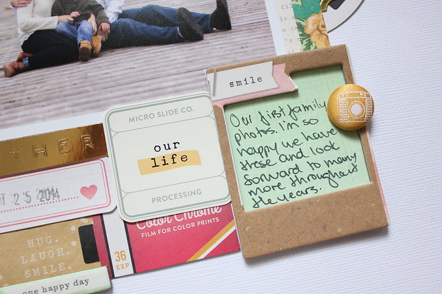
I started by centering my photo and just pulling every little bit from the epehmera pack, chipboard and flat sticker sheets that I loved and just layered them around.

021

I can't seem to make a page these days without including a chipboard frame. Can't stop. Wont stop.

captred b

023

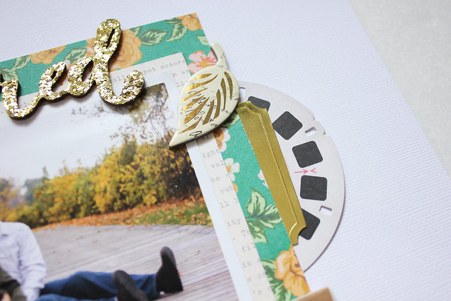
I love the gold Thicker works in this line so much. I'm such a sucker for gold glitter.